Longform Context UX
Study 01/08Captured 2026-07-11

Tubik StudioDesign Education

UX Design: How to Make User Interface Readable

The article funnels from a broad 72px display title into a narrower deck and a stable 900px prose system, then periodically expands media to 1140px. Mobile is a real re-composition: utilities reorder, the fixed header simplifies, body type changes from 20/35px to 16/24px, and all evidence becomes a single 360px column.

Open the original article
First viewport of the original Tubik Studio page, captured 2026-07-11.

Verdict

A confident studio article uses a neutral shell, strong chapter type, and wide evidence breakouts to make a very long design lesson scannable, though its desktop prose measure and heavy global DOM deserve restraint.
Evidence limits. Hover transitions were measured, but keyboard/focus behavior was not exhaustively traversed. Legacy lazy sources were loaded for complete screenshots; observations describe the live page captured on 2026-07-11.

What changes, and what merely resizes.

This evidence pair keeps the first viewport constant enough to compare hierarchy, media priority, and the cost of adaptation. Classification: recomposed.

Desktop first viewport showing the original page hierarchy and composition.
Desktop, 1440 × 10002026-07-11
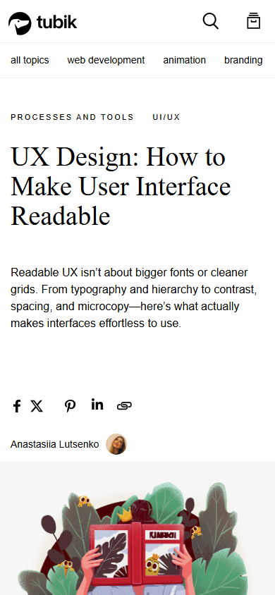
Mobile first viewport showing how the original page adapts its hierarchy and composition.
Mobile, 390 × 8442026-07-11

How the article spends attention.

  1. 01 Global header

    Fixed Tubik/blog navigation with search, browse, contact, and a topic row.

  2. 02 Article identity

    Taxonomy, large H1, narrow explanatory deck, author, and share actions.

  3. 03 Opening evidence

    Colorful hero illustration followed by narrative setup and the legibility-versus-readability distinction.

  4. 04 Typography chapter

    One H2 with five numbered H3 lessons and large product examples.

  5. 05 Broader UX chapters

    Hierarchy, structure, writing, contrast/accessibility, personalization, and a final practical test.

  6. 06 Discovery tail

    Recommended reading, share/copy utility, newsletter, related case studies, tags, archives, categories, and studio footer.

Two compositions, one editorial promise.

Desktop observations

  • A 1170px centered container holds 900px paragraphs/headings and up-to-1140px evidence images.
  • The H1 uses 1054px while the deck is only 684px, creating a clear broad-to-narrow opening funnel.
  • Body text is 20px with 35px line-height and 20px paragraph spacing.
  • The fixed two-row header is about 89px tall and preserves broad site navigation.
  • The loaded page measured about 23,795 CSS pixels, with large media gaps acting as chapter punctuation.

Mobile observations

  • The effective article/media column becomes 360px inside 15px gutters.
  • H1 changes from 72/82px to 38/41.8px; body changes from 20/35px to 16/24px.
  • Share actions move ahead of the author, changing the reading sequence rather than merely stacking desktop rows.
  • The header contracts to about 60px and topic navigation becomes horizontally constrained.
  • Media loses the desktop breakout and fills the single content column.

A representative reading beat

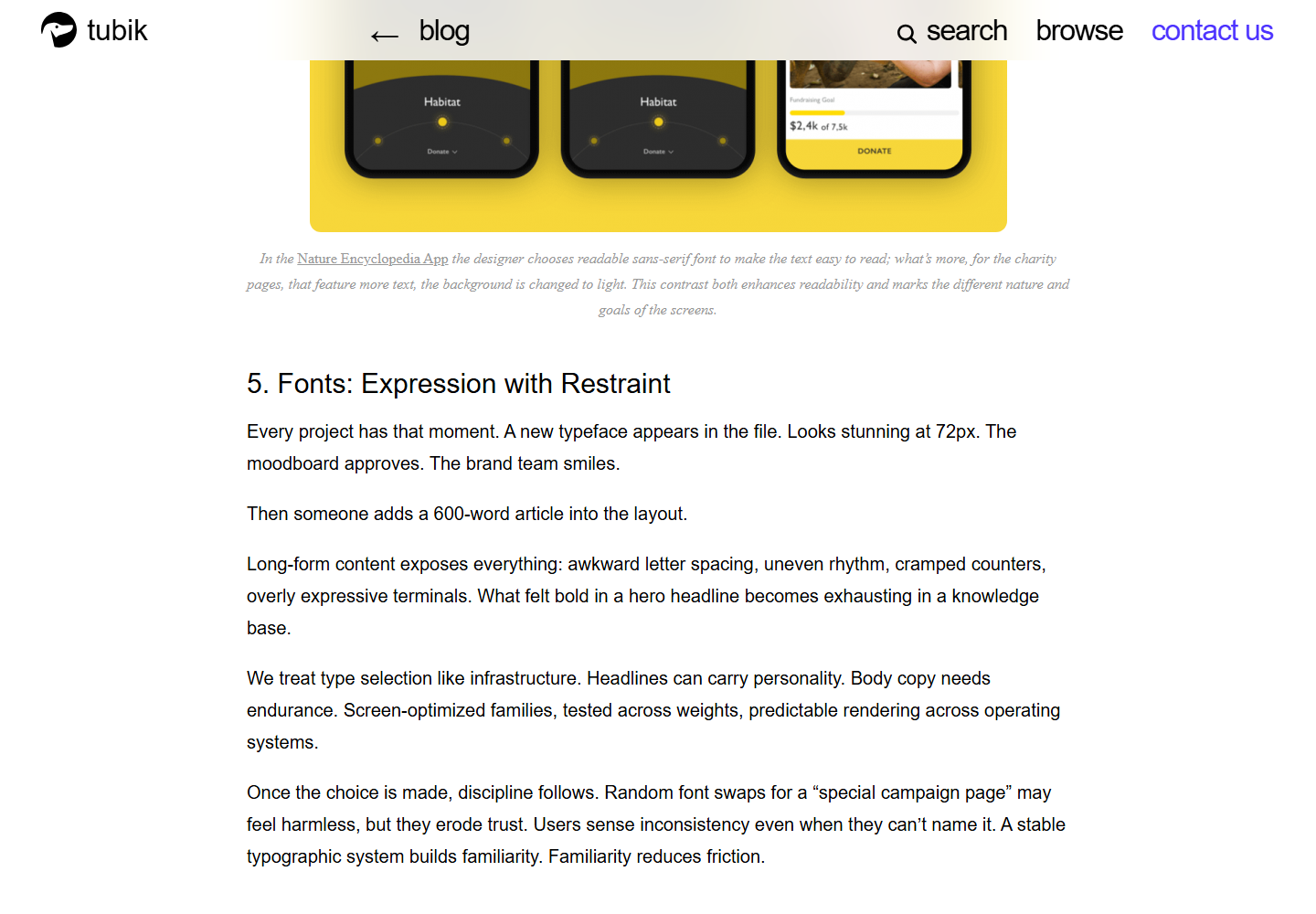
Representative desktop article body showing the source page's reading rhythm, media, and local hierarchy.
Desktop article body2026-07-11
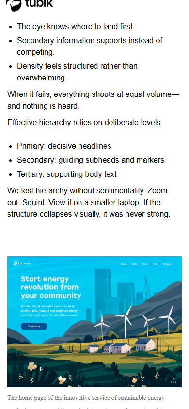
Representative mobile article body showing how the source page adapts its reading rhythm, media, and local hierarchy.
Mobile article body2026-07-11

The system behind the mood.

Typography

  • TWKGhost-Regular handles major display headings; TWKLausannePan-350 handles body and instructional headings.
  • Desktop H2 is 38/38px and H3 is 30/30px; mobile H2 stays visually dominant at 38/42.18px while H3 becomes 28/28px.
  • Gilroy appears in secondary site utilities rather than the article's primary reading voice.
  • The 900px desktop prose width is likely longer than a conventional 65-75ch reading measure in this body face.

Color and imagery

  • The shell is white with black/gray text and a rare violet contact accent.
  • Product/UI screenshots and illustrations supply most of the color, functioning as evidence rather than decoration.
  • The page contains 22 image elements, a hero background image, and an embedded Vimeo frame.
  • Images expand beyond prose on desktop and return to the content width on mobile.

Motion and interaction

  • No entrance or scroll-driven content animation was observed; content is visible by default.
  • Header transitions are about 300ms, label swaps about 500ms, and common link hovers about 300ms.

Orientation is part of the story.

01
Fixed global navigation keeps escape routes visible but there is no article progress bar or sticky section outline.
02
Share controls appear at the opening and copy/share utility returns near the close.
03
Recommended reading and four case-study cards bridge the article into studio discovery.
04
Newsletter, taxonomy, and collaboration modules create a long commercial tail after the editorial conclusion.

Access, weight, and reader trust.

Accessibility

  • All 22 image elements had an alt attribute, but five had empty alt text and not every empty value was confirmed decorative.
  • Utility H4 headings such as Tags and Archives create skipped heading levels in parts of the outline.
  • Six anchors in the full DOM had neither visible text nor an aria-label; many anchors belonged to hidden/global navigation states.
  • Several desktop header links measured about 39px high, below a 44px touch-target guideline.

Performance restraint

  • Eleven image elements use native lazy loading while other article images rely on a legacy data-src loader.
  • The mixed lazy-loading implementation exposed placeholders until the intended sources were triggered in the capture environment.
  • The full DOM contained 1,068 anchors, many in hidden/global menus, suggesting avoidable markup weight.
Readability 4/5
Orientation 3/5
Narrative pacing 4/5
Responsive adaptation 4/5
Media integration 4/5
Accessibility 3/5
Performance restraint 3/5
Transferability 4/5

Borrow the mechanism.

Opening funnel

Give the title a broad measure, narrow the deck, then settle into a stable prose column.

Evidence breakout

Let media expand beyond prose only when it demonstrates a lesson the text cannot.

Literal chapter hierarchy

Use H2 for chapters and numbered H3s for resumable instructional sub-sections.

Neutral shell, saturated proof

Keep interface color restrained so project examples provide the visual energy.

Mobile utility rewrite

Reorder share, author, and metadata by reading priority instead of preserving desktop alignment.

Keep the lesson. Leave the signature.

  • Do not adopt a 900px prose measure without checking actual characters per line.
  • Do not reproduce the mixed legacy/native lazy-loader path.
  • Do not let a large discovery tail blur the editorial endpoint.
  • Borrow the hierarchy and breakout system, not Tubik's fonts, logo, violet accent, or illustration signature.

What this asks of the frontend.

01
Use separate outer, prose, and media width tokens; tune prose by ch as well as pixels.
02
Model display, chapter, instructional, body, and utility type as distinct semantic roles.
03
Explicitly reorder opening utilities at the mobile breakpoint with grid areas or flex order.
04
Reserve responsive media aspect ratios and keep captions in the prose measure.
05
Add a lightweight progress/section navigator if adapting this system to an even longer article.

Read the dated learning file for the full observation log.

The entire scroll, preserved.

Show desktop full-scroll overview Compressed full-scroll desktop overview of the original Tubik Studio page, showing overall pacing rather than readable text detail.
Show mobile full-scroll overview Compressed full-scroll mobile overview of the original Tubik Studio page, showing overall pacing rather than readable text detail.