Longform Context UX
Study 05/08Captured 2026-07-11

ShorthandVisual Content Guide

5 Excellent Examples of Longform Content

Shorthand demonstrates its subject through split heroes, full-bleed color fields, device scenes, and repeated Why it works analyses. On mobile, side-by-side and sticky compositions become an intentional image-then-explanation order, preserving narrative causality instead of desktop geometry.

Open the original article

First viewport of the original Shorthand page, captured 2026-07-11.

Verdict

A persuasive meta-example that alternates narrow explanation with immersive showcase stages, then turns every visual chapter into a reusable rationale.
Evidence limits. The inspection provides no analytics evidence for traffic, completion, comprehension, or conversion. Full-page captures flatten sticky states and may show empty color fields; hero, body, and live viewport evidence carry detail.

What changes, and what merely resizes.

This evidence pair keeps the first viewport constant enough to compare hierarchy, media priority, and the cost of adaptation. Classification: recomposed.
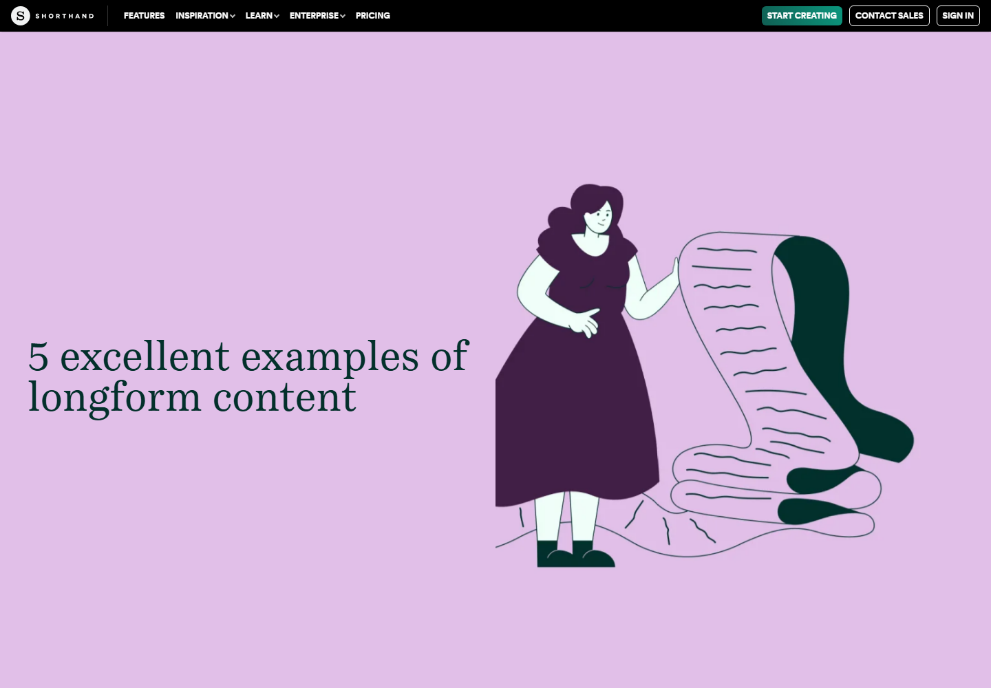
Desktop first viewport showing the original page hierarchy and composition.
Desktop, 1440 × 10002026-07-11
Mobile first viewport showing how the original page adapts its hierarchy and composition.
Mobile, 390 × 8442026-07-11

How the article spends attention.

  1. 01 Editorial poster

    A compact black product bar sits above a lilac split hero with display headline and illustration.

  2. 02 Framing

    Introductory myth-busting, byline, contents, and planning guidance establish the evaluation criteria.

  3. 03 Five showcases

    Each example receives a large media scene, short description, and numbered Why it works rationale.

  4. 04 Product education

    Definitions and benefits convert the examples into practical guidance for creating longform work.

  5. 05 Continuation

    Related cards, newsletter, Top control, and Shorthand attribution close the article.

Two compositions, one editorial promise.

Desktop observations

  • The 1440px hero divides into two approximately equal halves for headline and illustration.
  • A sticky black header remains only about 46px high while retaining desktop product links and calls to action.
  • Explanatory copy narrows to roughly 600px at 23px/39px, while showcase media expands toward viewport scale.
  • Sticky or scroll-activated device scenes create strong chapter pauses before the centered rationale resumes.

Mobile observations

  • The compact black header retains the Shorthand mark while the desktop link cluster leaves the captured surface.
  • The hero deliberately places the full-width illustration before the headline instead of shrinking the desktop split.
  • Body text becomes about 19px/32px with 25px gutters and major display headings reduce to roughly 33px.
  • Showcase media stacks above its Why it works analysis, preserving the sequence of encounter then interpretation.

A representative reading beat

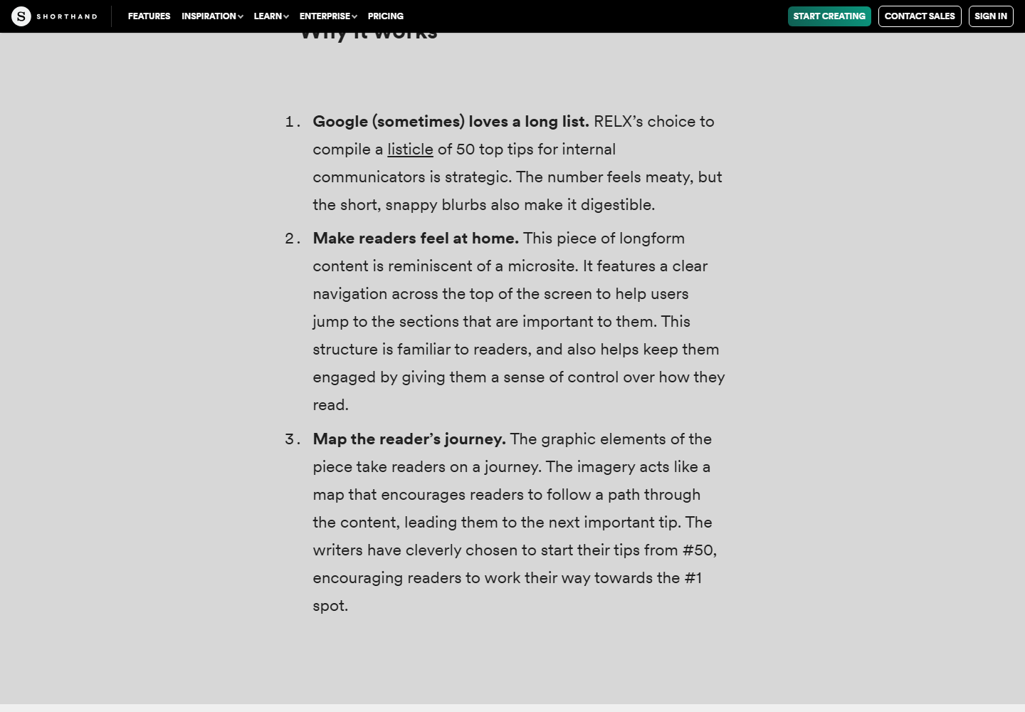
Representative desktop article body showing the source page's reading rhythm, media, and local hierarchy.
Desktop article body2026-07-11
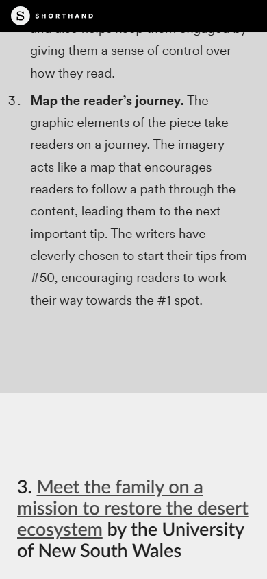
Representative mobile article body showing how the source page adapts its reading rhythm, media, and local hierarchy.
Mobile article body2026-07-11

The system behind the mood.

Typography

  • Passenger Serif provides expressive display headlines while Circular Web carries prose and interface text.
  • Desktop separates approximately 73px chapter titles, 32px rationale headings, and 23px prose.
  • Mobile compresses the scale while preserving distinct display, rationale, and body roles.

Color and imagery

  • Dark green, lilac, soft gray, darker gray, pale mint, and near-black form a small recurring set of chapter fields.
  • The hero is playful editorial illustration; later media is documentary evidence of the showcased publications.
  • Device frames and full-width scenes let readers inspect examples before reading the judgment.

Motion and interaction

  • Sticky media, scroll-triggered activation, and transitions stage examples as chapters.
  • No reduced-motion override was detected in the accessible stylesheets inspected during this session.

Orientation is part of the story.

01
An initial contents list and numbered chapter pattern provide structural orientation.
02
The product header remains sticky, while related reading and newsletter conversion are deferred until after the explanatory arc.
03
A persistent article percentage indicator was not visible in the captured experience.

Access, weight, and reader trust.

Accessibility

  • Strong contrast, narrow prose measure, and numbered textual rationales preserve meaning beyond the visual scenes.
  • The inspected hero alternative text appeared mismatched to the visible illustration, and the author portrait exposed no useful alt text.
  • Sticky scenes need source-order, keyboard, no-script, zoom, and reduced-motion verification.

Performance restraint

  • The extremely deep page uses large image stages, device mockups, sticky layers, and lazy or animated assets.
  • No page-weight, Core Web Vitals, memory, or field-performance measurement was performed.
Readability 4/5
Orientation 3/5
Narrative pacing 5/5
Responsive adaptation 5/5
Media integration 5/5
Accessibility 3/5
Performance restraint 3/5
Transferability 5/5

Borrow the mechanism.

Demonstrate the subject

Let the article's own pacing and media treatment embody the design guidance it offers.

See, explain, abstract

Show a case, describe what the reader sees, then enumerate why it succeeds.

Elastic reading width

Alternate a disciplined prose measure with wide media to produce meaningful rhythm.

Mobile narrative order

Recompose split scenes into the sequence that makes the argument easiest to follow.

Keep the lesson. Leave the signature.

  • Do not add scroll effects without an explanatory or comparative job.
  • Do not hide essential facts inside a single active sticky state.
  • Do not let a minimal mobile header become a navigation dead end.

What this asks of the frontend.

01
Model each example as structured data with title, description, media, rationale points, theme, and mobile order.
02
Use a shared narrow prose token plus separate full-bleed media containers.
03
Build sticky behavior as progressive enhancement over a complete semantic source order.
04
Under reduced motion, disable pinning and transforms and show a representative frame inline.
05
Reserve media dimensions and use responsive sources with conservative below-fold loading.

Read the dated learning file for the full observation log.

The entire scroll, preserved.

Show desktop full-scroll overview Compressed full-scroll desktop overview of the original Shorthand page, showing overall pacing rather than readable text detail.
Show mobile full-scroll overview Compressed full-scroll mobile overview of the original Shorthand page, showing overall pacing rather than readable text detail.